Typography

Typography in websites is arguably more important than other design elements since type is the one thing that is consistently rendered across different browsers. Properly selected Fonts make it easy to bring personality to your project. We allow webmasters a choice, they can use Google Fonts or/and System fonts. Of course, anytime they can also upload and set their own custom font using custom CSS.

Fonts can be used for the whole website (Body), Headers (H1-H6), and Navigation (Main Menu). You can also assign the  Fonts to specific CSS elements (Class / ID) only.

Typography Options:

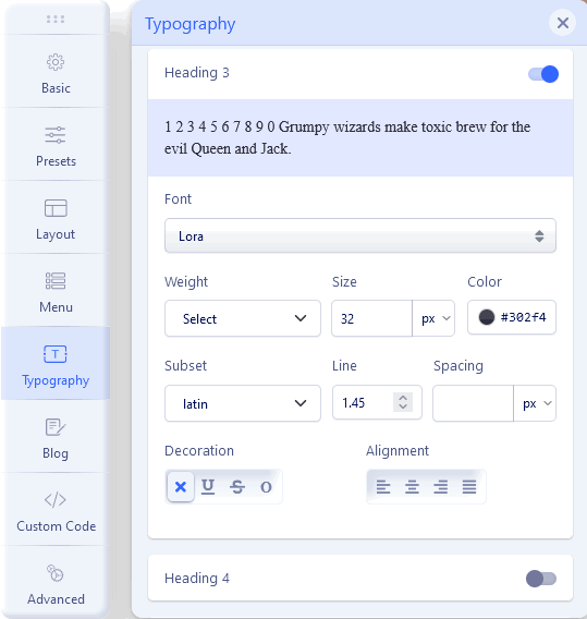
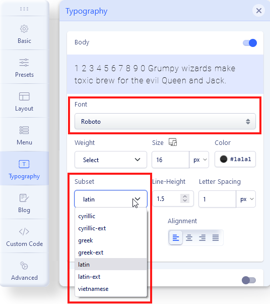
  1. Font – Choose your font family
  2. Weight – Choose the weight of the font
  3. Size – Choose a size for your font (px, em, etc.)
  4. Color - Choose a color for your font
  5. Subset – Option for Google Fonts only. Choose subset used for language native letters for the font, like Latin, Latin Ext, Cyrillic, and Greek. Not all Google Fonts support your native language, so you may not see all extra diacritical marks. In that case, you have to choose a different font.
  6. Line-Height – Set your line-height, the distance between lines of text. It's a number that will be multiplied by the current font-size to set the line height. This is not px value.
  7. Letter Spacing – Set horizontal spacing between text characters. Positive values of letter-spacing cause characters to spread farther apart, while negative values of letter-spacing bring characters closer together.
  8. Alignment - Set the horizontal alignment of the content.

Accessibility tips:

  • Font Color - ensure that the contrast ratio between the color of the text and the background color is placed over is high enough that people experiencing low vision conditions will be able to read the content of the page.
  • Use a minimum value of 1.5 for line-height for main paragraph content. This will help people experiencing low vision conditions, as well as people with cognitive concerns such as Dyslexia.
  • A too large positive or negative letter-spacing value will make the word(s) the styling is applied to unreadable.
  • The inconsistent spacing between words created by justified text can be problematic for people with cognitive concerns such as Dyslexia.

Google Fonts

In general typography in Helix Ultimate templates is mainly based on the Google Fonts collection (950+ fonts). With so many unique fonts to use, you're bound to find something you like! This settings area allows you to easily choose font(s) from the Google Font Directory to your Joomla! template. The Google Fonts is compatible with popular (and updated) browsers. They work reliably on the vast majority of modern mobile operating systems, including Android browsers and iOS 4.2+ (iPhone, iPad, iPod). Support for earlier iOS versions is limited. All available Google Fonts are released under open source licenses. You can use them in any non-commercial or commercial project.

Notice! Not all fonts fully support your native language diacritical marks (signs). Check it on Google Fonts Website before complaints.

Google Fonts in HU 2.0
Google Font subset

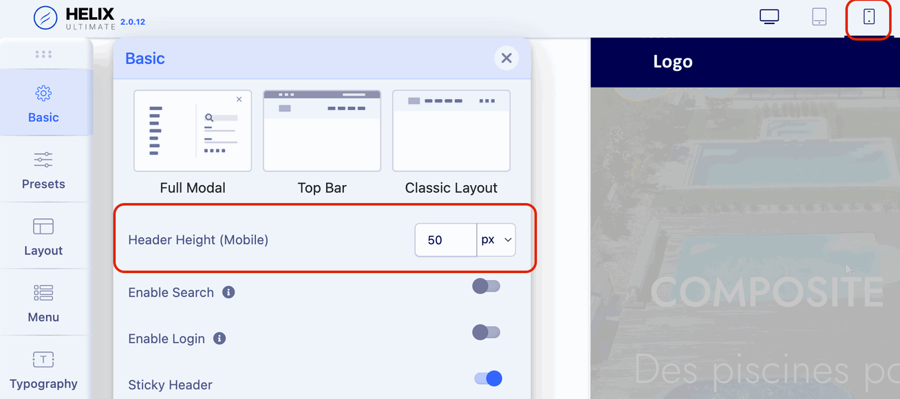
Tip! To change the font size used for Tablet and Mobile view - please first change the view using top icons Desktop (default), Tablet, or Mobile - then selected font size.

All other options (like Font Weight, Color, Decoration, Line height) are global, so they are used on all views.

Mobile font

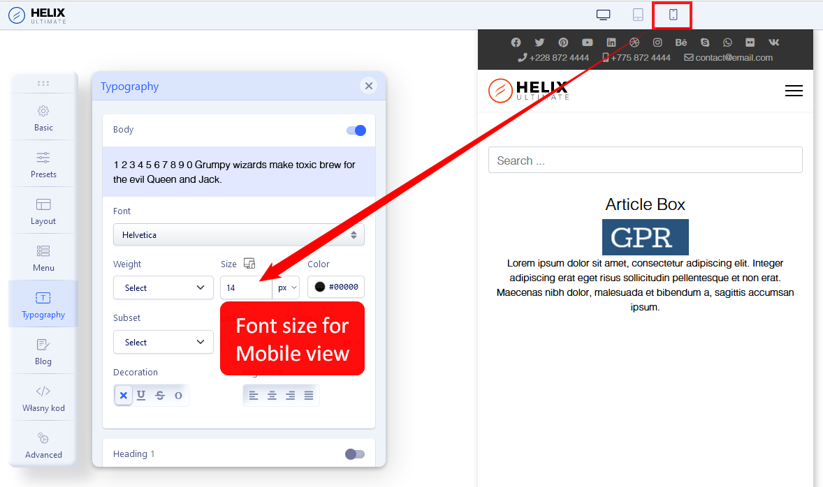
Font size for Mobile view

GDPR/EU-DSGVO/Privacy Policy and Google Fonts

By new law is not allowed, to collect private data from your website visitors without permission.

Google Fonts is a service provided by Google Inc. from the USA. There is no doubt that Google Fonts relies on the generic Google Privacy Policy. The Google Fonts API (used inside Helix Ultimate) is designed to limit the collection, storage, and use of end-user data to what is needed to serve fonts efficiently. The use of Google Fonts is unauthenticated. No cookies are sent by website visitors to the Google Fonts API. Requests to the Google Fonts API are made to resource-specific domains, such as fonts.googleapis.com or fonts.gstatic.com, so that your requests for fonts are separate from and do not contain any credentials you send to google.com while using other Google services that are authenticated, such as Gmail. The use of Google Web Fonts follows from an interest in a uniform and appealing online presentation of services. This represents a legitimate interest within the scope of Article 6 (1) 1 lit. f GDPR. About the transfer of personal data to the US, Google has submitted to the EU-US Privacy Shield, https://www.privacyshield.gov/EU-US-Framework. More information about Google Fonts and privacy can be found here: https://developers.google.com/fonts/faq#what_does_using_the_google_fonts_api_mean_for_the_privacy_of_my_users.

In general, Google claims GDPR compliance. But if you feel that Google's explanations are not enough for law regulation in your country - anytime you can decide to:

  1. Do not use Google Fonts on your site, disable them from Typography settings, and use classic fonts (tip below).
  2. Replace Google Fonts loaded from Google servers to loaded from your server (tip about it you will find in "Customization Tips" section). Use google-webfonts-helper service which makes it easy to self-host any font from Google Fonts. If you embed them from your server, everything in a legal way would be OK again.

Arial, Verdana, Georgia...

You can choose widely supported cross-platform fonts: Arial, Tahoma, Verdana, Helvetica, Times New Roman, Trebuchet MS, and Georgia. “Web Safe” fonts mean that they will look perfect no matter the browser you are viewing them from. Also, these fonts are very popular and pre-installed on the operating systems: Windows, iOS, or Linux. You can save bandwidth and keep fast-loading pages using them.

Menu

Inside the Menu tab you will find the following tabs:

  • Menu Builder - to manage menu structure and menu items content
  • Mega Menu - basic settings for MegaMenu display
  • Off-canvas - to manage appearance and content of Mobile Menu [=]

Is an advanced system that allows you to manage menu structure (all menus) with all used items there. By default, it displays MainMenu with all submenu items. Using a mouse you can change the order of menu items, just grab and move up or down. You can also add a new menu item.

  • Pen Icon - opens window edit options of chosen Menu Item.
  • Basket Icon - allows you to delete chosen menu item.
  • Grear Icon - extra settings for chosen menu item (Show Menu Title, Dropdown position, Icon, Custom Class, and Badge).
  • Boxes Icon - access to extra settings and Mega Menu options if it would be enabled there. You can add and use badge, icon, and row and column-based menus, also drag and drop the modules to the menu positions from the modules list.

How to build advanced Submenu

If you want to have 2-3-4 columns in the menu as the first step you should start with building menu structure - add submenu items to the main menu item, it's similar to the root structure. Here is an example of three columns submenu.

menu structure

As 2nd step in the first main item please click the "Mega Menu" icon, then enable the "Mega Menu" option.

MegaMenu

Now you should click the "Add New Row" button. Now you can choose the column structure (it's based on Boostrap columns grid) - you can use a predefined layout or create your own (Custom).

3 columns menu

Custom Submenu structure is quite elastic so you can have many different grid layouts - for this purpose we created a "Custom" button. In theory summary of all columns should be equal to 12. For example: 6+3+3 or 5+5+2.

custom layout

Anytime you would be able to delete or redesign layout structure by using icons on the top right position.

You can also change the order of columns content - hover on the column name until you would see a two-direction arrow icon then you can move the column to the left or ride side, later save settings to see changes.  

move column

How to add a module inside the submenu

If you enabled Mega Menu and you have a row with a single column or columns you can add now any module from the list of available or installed. For example, you can display a banner, the latest articles, or a login module. Just click plus (+) icon inside the column where the module should be, then selected a module.

menu structure

How to add icons in menu items

Using the Mega Menu options allows you to insert an icon next to a menu item and/or use an icon instead of a menu item. As the first step choose an icon from Font Awesome Free 5.15.x collection (around 1600 icons to choose from). You can search by name and preview them inside the map. You can also in the meantime open the FA website: https://fontawesome.com/v5.15/icons?d=gallery&p=2&m=free  - and find an icon that fits you the most.  Save settings to see the new or changed icon.

icon in menu

And to have an icon only without a text menu item turn off "Show Menu Title" and then click Save to keep settings.

Only icon

How to add badges in menu items

The badge is extra information displayed next to a menu item, it's a helpful feature to highlight a menu item. You can use any word there. Then choose the position of the badge (left, right). Next select background color and text color, if you would not choose any color options, by default dark red with white text would be used.

badge

Mega Menu

Menu type - by default, there are enabled two separate menus: Mega Menu and Off-Canvas Menu [=] - sometimes called Hamburger Menu, because of the used shape. In desktop view, you can use both or only MegaMenu. It is pretty easy to disable the Off-Canvas menu from desktop view only. Just select "Mega Menu" and Save settings.

Menu Type

Dropdown Width -  Width value is used to declare submenu width content area. By default is 240px. You can choose not only value itself but also different units for expressing width (px, em, rem, %).

Dropdown Animation - Mega Menu offers several transition options for your dropdown submenus:

  • No Animation
  • Fade In
  • Fade In Up
  • Fade In Down
  • Rotate In
  • Zoom In
  • Pulse

This is the transition that occurs when the submenu is opened. To have the sub-menu appear with no fancy effect, just set it to None (No Animation).

Off-Canvas / Mobile Menu

Off-Canvas [=] is a mobile menu based on a menu module but customized by the Helix Ultimate framework. It's used in Mobile and Tablets view mostly. Yes, can be displayed on desktop view as well, in that case, just check Mega Menu tab settings.

Available settings:

  • Off-canvas Position - select a position for the off-canvas menu, it can be on the left or right side.
  • Select Offcanvas - select premade design for displaying the off-canvas menu (left align, left bordered or center align). Yes, you can create your own design. Just create a new style here:  templates\shaper_helixultimate\offcanvas - using one of the existing styles as source code inspiration. 
  • Select Offcanvas Menu - select which menu should be used for the off-canvas (mobile) menu. Compare to old helix framework versions now by default, you don't have to publish any menu module to get the mobile menu.
  • Maximum Level - select what deep of menu structure should be displayed in the Off-Canvas (Mobile) Menu. If you choose 'All', all levels will be shown.
  • Show Logo -   you have control of the display of your website logo in the off-canvas menu in top area.
  • Enable Search - display the search (classic search in J3.x) field in the off-canvas box.
  • Enable Login - display login icon that allows users to be redirected to login view.
  • Enable Social Links - display social links at the bottom of the Off-Canvas Menu.
  • Show Contact - display contact information, for example, phone number and e-mail.

Important note! Please do not use the "Menu Heading" nor "Separator" menu type for the Main Menu items, otherwise in the Mobile (Off-canvas) menu, you will not see the ">" icon that allows you to expand the menu to see the submenu items. You can use an Article, Blog, or any component view or URL with "#" used as a link.

mobile menu

Notice! Remember to add and publish a Menu module on "offcanvas" position. If your site has more than one language, use two or more menu modules for each language separately.

mobile menu

How to show/hide logo inside off-canvas menu

In Template Options > Menu  > Off-Canvas (tab) > Show Logo: On/Off

How to add an image to the off-canvas menu

If you want to display a selected image (for example ads banner) in the off-canvas menu area, below the menu please follow the steps:

  1. Create a new module "Custom" in Joomla > Modules.
  2. Put your logo image inside. Remember that the used image must have contrasting colors compared to the background color.
  3. Publish that module position "offcanvas" or "offcanvas-modules" - just choose from the list of positions.
  4. Assign the module to all pages (menu items).

How to get more than one Mobile Menu

You can use more than one [=] mobile menu published in "offcanvas" position:

  1. in Module Manager add a new "Menu" module.
  2. Select a different Menu from the list.
  3. Set Position "offcanvas" or "offcanvas-modules" (look at the screenshot above)
  4. Select the order of module, probably need the below added before.
  5. Disable Module Title.
  6. Select the specific Menu assignments - probably you want to set it to all Menu Items.
  7. Select a module language if you have more than one active on your site.
  8. Then publish the module.

Module positions inside the Mobile Menu

In Helix Ultimate you have two module positions that you can use in the Mobile menu area:

  • offcanvas
  • offcanvas-modules (is placed below)

By using Custom CSS and order Property you can make some basic changes and change the order of displayed blocks.

Layout

Layout Manager allows you to build a flexible layout based on module positions. Layout Builder is one of the unique features of Helix Ultimate 2.0 which allows webmasters to customize the existing template in almost any shape without code customization.

Layout Grid

Helix Ultimate Layout is based on a 12-column layout from Bootstrap 5.2.x. It includes a powerful mobile-first flexbox grid system for building layouts of all shapes and sizes. Helix grid system uses a series of containers (they can be switched off), rows, and columns to layout and align content.

You can choose columns preset or set your own grid. The grid system is responsive, and the columns will re-arrange depending on the screen size.

  • In the current version of Helix Ultimate, you can use Predefined Headers. We’ve added 9 built-in header variations to a template that will enrich the scope and versatility of your sites created with the framework.
  • Rows are wrappers for columns. Each Row can have its own column structure and unique settings.
  • Icon with arrows allows you to change the positions of rows by moving them up or down.
  • Use the plus icon to add a new Row, then choose column structure and select the module position(s) used there. We also suggest inserting a short ID name for the new Row.
layout

 Available features (with related icons):

  • [6 dots] - it's a drag-and-drop area, put a mouse cursor over it and move the row below or above others.
  • [4 blocks] - it's a column layout selector, where you can change column structure inside the row based on 12 column system.
    Only one row is available in a single section. Choose one from the predefined or set your own grid. When using a Custom Layout, remember that the sum of columns must always be 12. For example, you can insert 6+6, 3+3+6, or 4+4+4.
  • [basket/bin] - it allows you to delete a current row with all elements inside. 
  • [sliders] - Row Options from access to advanced settings: name, fluid width, custom CSS class, style settings, and responsive (hide that row).
  • [3 dots] - give access to Column Options, from there you can set this area as a component (only one can be in this role), choose a module position from the list, insert Custom CSS Class, set Grid for different views (desktop, tablet, large phone, phone), responsive options that allows you to hide that module position on (Phone, Large Phone, Tablet, Desktop/Laptop, Large Desktop)
new position in layout

Tip! Using proper Grid settings inside all columns in the row you can define different column structures for each device (desktop/tablet/mobile) separately.

Sticky Right or Left Column

Helix Ultimate Position Sticky Option

You can set the whole column (right or/and left) with all modules inside a sticky (fixed) position. A fixed position element is positioned relative to the browser window itself.  This means that when the window is scrolled, the viewport remains unchanged, keeping the module in its original position on the right or left side of the page. It's used for Desktop view only. Useful for extra navigation and banner modules.

Click on the three dots of your left or right module and go to the Column Settings. Locate the Position Sticky option. Enable it to make your whole column remain sticky either in the left or right side of the page.

Notice! This feature was introduced in the Helix Ultimate 2.1 update. Older Helix-based templates may not have this new feature (option). 

Template Positions

Except for the default one which you can see and use. The Helix template has two additional module positions (Content Top & Content Bottom), although they are not visible in Layout Builder, they can be used to display any modules above and below the component area.

If you want to use a position name that is not on the default list you can do it even without an edition of the template XML file. Just create a new module or edit an old one, put a unique module position name and click Enter, then save that module. Then you should be able to use that position in Template Layout.

Since Helix Ultimate 2.0.7 update you have a custom module position named “Off-canvas Modules” which removes the restriction of using only one menu in the Off-canvas. Now, you have the freedom to use multiple menu modules in the Off-canvas position and craft your off-canvas however you like. 

Custom Header! Using Layout features you can build also your own, custom header. But remember to use the "header" name for the "logo + menu" row to still have a sticky header. And of course, disable the Predesigned header (from the Basic - Header section).

Grid (Breakpoints)

Because Helix Ultimate is based on Bootstrap it allows you to choose different breakpoints used for columns inside the Rows. For example, you can use different column sizes for each view. Remember to change the settings for each column in the row. If you want to keep all columns in one row their summary must be 12 or smaller.

Responsive

Column Options > Responsive tab - from where you can hide a column on chosen devices. Those breakpoints are based on screen dimensions:

  • Phone (max-width: 575px, what means less than 576px)
  • Larger Phone (min-width: 576px, what means between 576px and 767px)
  • Tablet (min-width: 768px, what means between 768px and 991px)
  • Smaller Desktop/Laptop (min-width: 992px, what means between 992px and 1200px )
  • Desktop (min-width: 1200px, what means 1200px and up)

Custom Header

By default, in the raw Helix Ultimate template, there are 9 predefined Headers. But any time you can disable this option and build your own custom header variation. You can do this using two alternative methods depending on your expectations and skills by using:

  • "Layout" features - with new rows, columns, and module positions inside, or
  •  A Custom Header File - where you should use the needed structure code and custom HTML/PHP code as well.

Helix Ultimate Layout is based on a 12-column layout from Bootstrap 5. It also means that the summary of columns inside each row (section) should be always 12. For example 6+3+3.

Custom Header from "Layout" options

  1. In Template Options - "Basic" tab - Header - Predefined Headers - Turn it Off.
  2. Go to the "Layout" tab
  3. Hover over the first row.
  4. To create a new row click on (+) icon which should appear under the first row.
  5. Grab that Row and move up to make it first on the layout grid.
  6. Click the "sliders" icon to get into row options.
  7. Inside the field "Section Title" add name: header
  8. You can also set the header a full wide just by enabling the option "Fluid Width"
  9. Now you have to click a boxed icon to set the columns layout.
    Choose one from predefined or set your own (Custom).
    Less area reserved for the logo column - means that the presented logo would be smaller.
  10. Then for each column choose the module position from the list, for example, logo and menu*
  11. Select a responsive grid for each column, for Tablet and Mobile view. There are five grid breakpoints, one for each responsive breakpoint.
  12. Remember to Save changes to see results.
  13. Later you can set a  Header height for the Tablet and Mobile view.

    CHECK SCREENSHOTS BELOW
    Notify that Logo will be taken from Helix Basic settings and Menu from Helix Mega Menu engine.

Custom Layout - Header
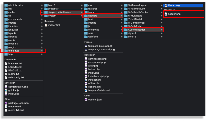
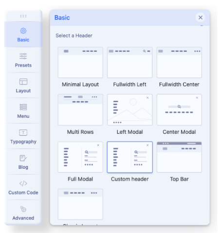
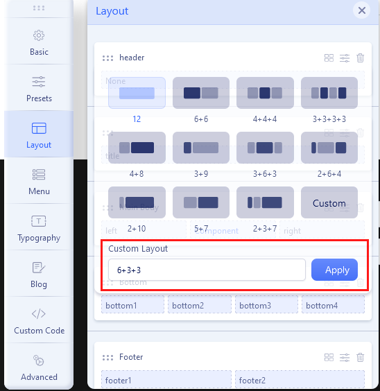
Custom Layout for a new Header.choose-module

In Columns Options set Grid: The sum of the values used for all columns in a row can not be greater than 12. So, for example for two columns grid, 6+6, 4+8, 2+10, or 3+9 are the correct values. We talk about "col-X" and "col-sm-X" numbers.

Sum of columnsNotice! You can create a custom top-bar section with top1, top2, and top3 positions. That Row is beyond the header area, so must be created as a separate & new Row with a column grid and selected module positions for them.You can set also Custom Header Height for each view: Desktop, Tablet, and Mobile. Make sure that the logo image height will fit inside the new header height value. In most cases, the Header height must be at least 10-20px higher than the logo height. To see changes (and recompile styles) remember to change in Advanced > SCSS > Compile SCSS to CSS turn Off / On. Header Height Mobile

As an additional source of knowledge, it is also worthwhile to watch some video guideshttps://www.youtube.com/results?search_query=helix+ultimate+custom+header

Custom Header based on File

custom header

The easiest way to create your own header (based on the header.php file) will be to use the header's code, which is already in the template, and which is graphically most closely resembles the one you want to achieve. Then you have to edit HTML and/or PHP code inside. This way allows you to create a more flexible header also with two rows inside and/or module position one below the other. All are based on simple php code and Bootstrap 5 grid system with all available classes for columns. You can also create your own graphic preview file (thumb.svg).

After creating a custom header file (with custom design there) you have to choose the "Custom header" option to make your file active. If you used a custom thumbnail image - it should be visible there.

custom header - choose here

Presets

Presets

The Presets tab gives you the ability to quickly and easily configure color settings related to the appearance of the Helix-powered template. This includes being able to switch between pre-configured presets with customization options and a custom color set.

color presets

By default Helix Ultimate 2.0 comes with 8 colors presets, which allows you to choose one color style. The Preset Selector gives users the ability to quickly switch between Presets, used for the whole template style, with a pre-designed color palette and style settings.

Each color Preset can be customized, after choosing it, just hover the color box to see the pen icon, then click it to Edit current Preset (screenshot below).

Edit Preset styles-colors

Custom Style

But you're not limited by only preset choices because you can enable “Custom Style” and choose there your own main colors. Notice, built-in presets will not work if this option is enabled.

For some areas, you can define those also from Layout tab, separately for each Row (section). If you want to define more colors or use extra CSS3 effects you have to use custom CSS to override default font color, background colors or other elements.

Information

All images are for demonstration purpose only. You will get the demo images with the QuickStart pack.

Also, all the demo images are collected from Unsplash. If you want to use those, you may need to provide necessary credits. Please visit Unsplash for details.